Benson Duong
Data Science major at UC San Diego
Interests in Data Science, Python Programming, Machine Learning.
Offer Acceptance Industry Research Project

(Click here for the actual website used for the project)
Table of Contents
Background
- I was part of a 6-month industry research project with 3 other students, under the mentorship of Flock Freight, a delivery logistics company.
- I worked with Nima Yazdani, Radu Manea, and Keagan Benson.
- The background to Flock Freight’s mission is:
- A company needs to deliver an order from Point A to Point B, but lack their own trucking or delivery services to do so.
- Trucking Service companies, or “Carriers”, are willing to give offers to deliver any shipments at a given cost
- Flock Freight is the intermediary, or “Freight Broker”, between both parties.
- For a given Company X in need to deliver Order X, a number of N carriers - (“Carrier i”) will give offers (“Offer i”) to deliver it for a certain cost a.k.a. shipping offer rate (“rate i”), where “i” is 1,2, 3….N.
- And Flock Freight’s questions are:
- Knowing just Order X alone, predict N (the number of carriers that will make an offer).
- Knowing just Order X alone, predict the cheapest offer rate the order might get.
- Flock Freight gave our team anonymized data that included those about the orders themselves, which were just: the origin and destination zipcodes (the zip3) of the shipment order,the date of deadline, and physical characteristics about it (i.e. whether it’s hazardous, or needs refridgeration).
- After 20 weeks of intense collaboration and learning from Flock-Freight, my team and I constructed a final prediction model for determining if a given offer was worthy of selection. The new model was able to reduce Flock Freight’s costs by 9.8%.
- We also authored a project paper, and showcased our work to peers, college faculty, and industry professionals.
Personal-Contribution
So what did I do?
- Prediction Modelling and iteratively improving their accuracies
- Our team’s final prediction model was actually a “conglomerate” of 3 prediction sub-models. Nima and I was responsible for two of them. They were incremental (the 1st was a baseline model that the 2nd built off of), and it was finding the cheapest rate.

- So f_µ is a linear regression model for estimating the mean offer rates of orders, so its predictions are used as the thresholds on if an offer-rate is below-average (cheap). With an accuracy of 87%, this is good enough as a baseline model.

- The threshold for the conglomerate model F is expanded further with a predictive model f_σ for each order’s offer rate standard deviation. If an offer-rate is lower than the expected average by a whole standard deviation, it is very cheap.
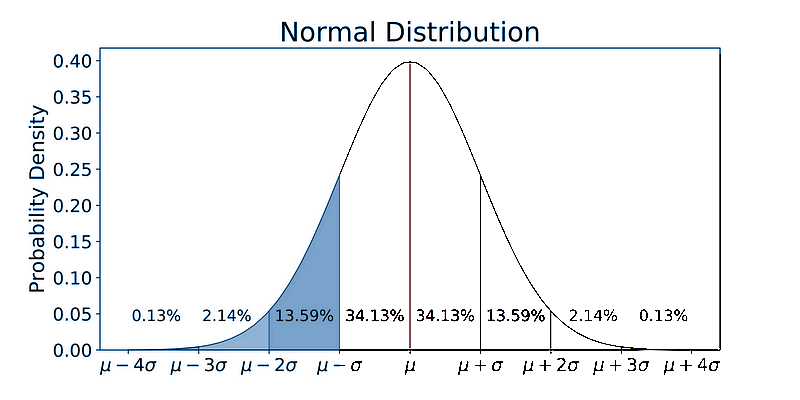
- But this tactic has flaws: any order’s offer amount N could vary as low as 3; in a ~16%-sized blue-shaded region in the bell-curve above, that is small enough to get cut off and leave us nothing.
- To be less strict, the standard deviation can be scaled by a “dampener” constant lambda between 0 to 1. 0 would mean F is now no different than just using f_µ.

- The new score with f_σ was not good and lower than the f_µ. Many weeks went into improving the score at 57%-60%, until it reached 67% (see the next “Challenges” section). This meant a cycle of consulting with our industry mentor as the subject-matter-expert, sourcing new potentially useful data, data-cleaning, feature engineering, model-retraining, hyperparameter fine-tuning, peeking at EDA visuals (such as correlation matrix heatmaps to pinpoint correlated features). I took note of any “dead-ends” in terms of exploratory data analysis, to prevent accidental repeat. All of these eventually improved the model’s accuracy by ~17%. Since EDA like this is a rabbithole, this is the AGILE reason behind the incremental models, because the first model with just f_µ could be good enough on its own.
- Final model: Random Forest
- Final (and improved) test accuracy: 67%.
- Our team’s final prediction model was actually a “conglomerate” of 3 prediction sub-models. Nima and I was responsible for two of them. They were incremental (the 1st was a baseline model that the 2nd built off of), and it was finding the cheapest rate.
- Geo-Data
- Since this company dealt with transportation shipping, a lot of this project was geographical in nature.
- The original Flock Freight data only had one geographic feature - the orders’ origin and destination zipcodes.
- I had some familiarity with geo-data in the past, so I leveraged this asset for the team:
- Procuring external, geographic data sources for our project. This meant ETL python scripts that retrieved shapefiles using SodaPy Socrata API, or BeautifulSoup, then geopandas for transformation.
- Feature-engineering the geo-data to be in a usable and numerically understandable format to my other, less geodata-familiar teammates so they can continue the work from there.
- With GeoPandas, I made the geodata usable as structured data, by mapping the origin/destination string zipcodes to numerical X/Y coordinate columns (the centroids of their zipcode regions).
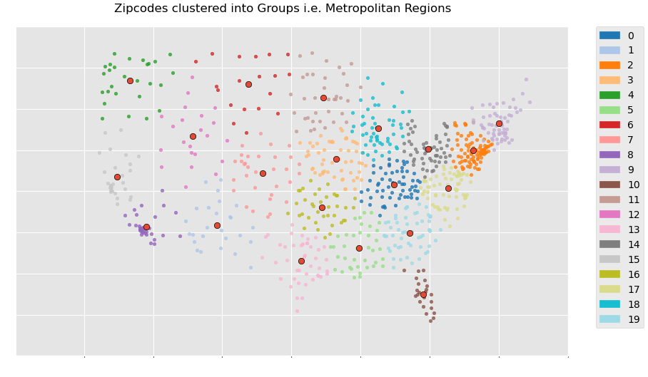
- But X/Y coordinates still aren’t really useful enough even as numerical information to the zipcode string. I applied K-means Clustering to the zipcode nodes, and thus grouped them into 20 “Regions”. The centroids of these regions would be used to actually encode the zipcodes (like zip2vec) by being like radial basis kernels in terms of softmaxed inverse euclidean distances.
- I represented the order’s “Delivery Route” by connecting each order’s origin / destination zipcode nodes. I brought in further geodata sources and used GeoPandas’s Intersection and Buffer methods to aggregate different information about the counties that the delivery routes crossed through. These included average population density, rainfall, etc. encountered during the shipping route for that order. Doing so could approximate the road-conditions of the delivery route, and potentially the demand for an order.
- Our team’s project showcase was able to uniquely showcase maps for data visualization.
- Impactful Insights
- I managed to uncover insights useful to Flock Freight’s business case. Some will be mentioned again in the rest of this page, but several are:
- With pandas data analysis, discovering the cheapest delivery offers frequently fell on Thursday, then checking its statistical significance with ANOVA testing.
- Providing a geographic “segmentation” of the delivery hubs by applying unsupervised ML (K-means clustering) to the zipcode nodes’s X/Y coordinates, thereby grouping them apart into 20 “metropolitan regions”.
- Producing data analysis on delivery data and uncovering:
- Delivery routes with the cheapest shipments tend to be along the west-coast or in Florida.
- Atlanta was a region of high delivery activity
- Information about the order’s delivery route itself, i.e. the average population density or weather road conditions (avg rainfall, temperature) of the counties encountered along the way, influenced on the demand of delivery offers for that order
- I managed to uncover insights useful to Flock Freight’s business case. Some will be mentioned again in the rest of this page, but several are:
- Productionizing Data Pipeline:
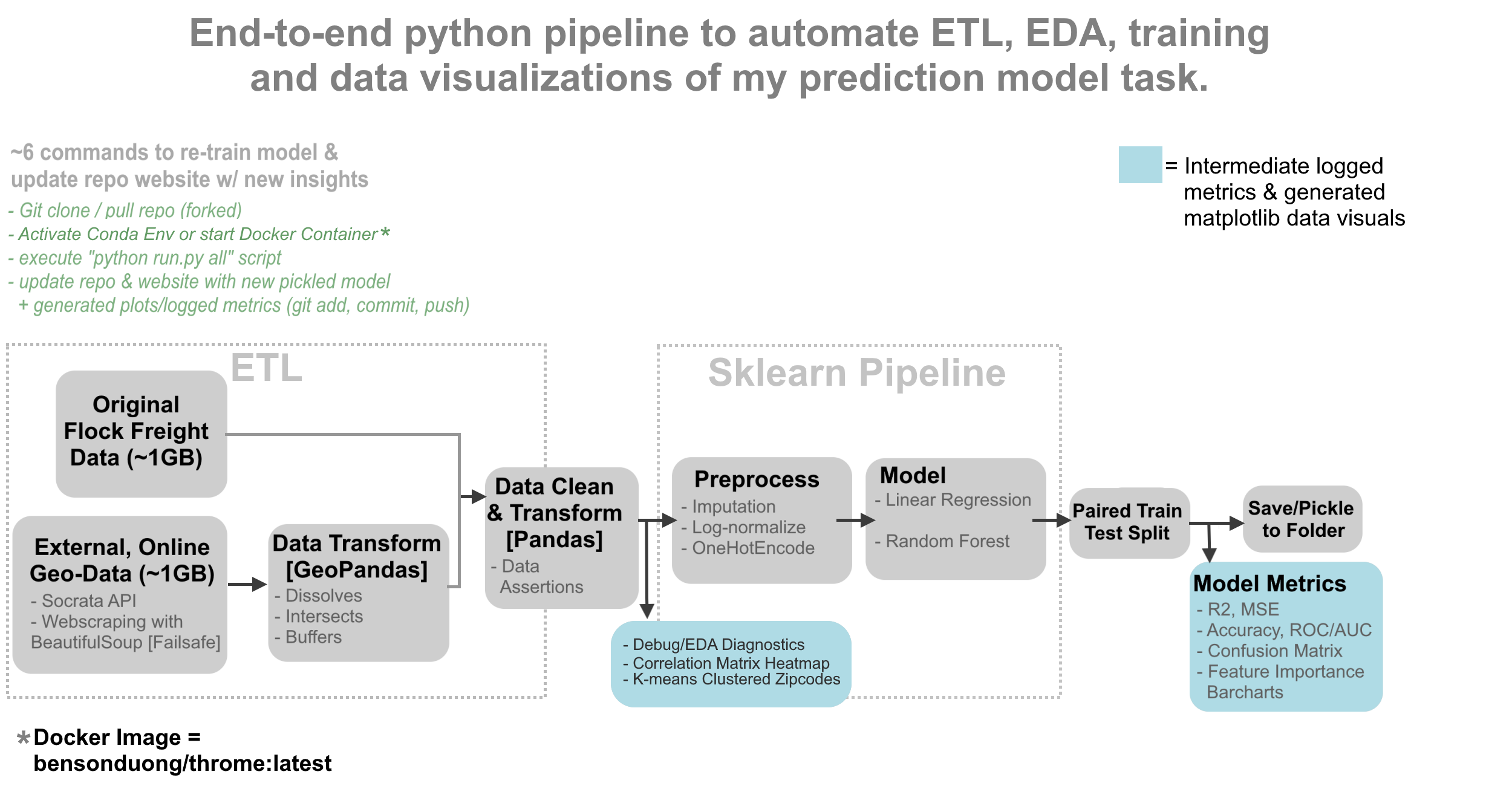
- As We had to improve the model’s accuracy by routinely adding and cleaning new data or retransforming old data then re-training it, it was repetitive to re-run the tasks again and again through Jupyter Notebook to find which different configuration of factors boosted the model accuracy. And so I developed Python scripts to automate nearly all stages of my tasks into an end-to-end pipeline, that could be done in at least 6 to 8 commands on the terminal that can be put into a shell script, so that when those 6-8 commands were executed, the pipeline automatically did the following things:
- Data retrieval with Socrata API or BeautifulSoup.
- Data transformations using geopandas, dbt, feature engineering with pandas, and machine learning with sklearn pipelines to train and test multiple ML models.
- Data cleaning tests using custom Python functions to ensure data quality and accuracy.
- Recorded EDA and model metrics using Python logging and generated visualizations with matplotlib.
- Updating of the image assets on own project’s website with those generated visualizations.
- Ensuring Reproducibility of the project by creating a Docker Image, and containerizing our group’s work.
- As We had to improve the model’s accuracy by routinely adding and cleaning new data or retransforming old data then re-training it, it was repetitive to re-run the tasks again and again through Jupyter Notebook to find which different configuration of factors boosted the model accuracy. And so I developed Python scripts to automate nearly all stages of my tasks into an end-to-end pipeline, that could be done in at least 6 to 8 commands on the terminal that can be put into a shell script, so that when those 6-8 commands were executed, the pipeline automatically did the following things:
Challenges
Challenges Faced & Overcoming Them
This real-world project came with real-world messy data -full of nuances and imperfections that served as challenges. Not all of them had singular solutions, and needed a combination of several solutions.
- Handling imbalanced data: the target column for the standard deviation sub-model was highly imbalanced; it was a severely right-skewed distribution lower-bounded at 0 inclusive. This aspect inhibited the regression accuracy to have scores below even 50%.
- Redefining the target column: in other projects, zero-bounded right-skewed distributions like these can be re-shaped into a bell-curve by log-transformation (Log(x+1)). But in this case, the column was still severely right-skewed after log-normalization. Several different combinations of transformation attempts led to dead-ends, and so I decided to ordinalize the column into 2 binary classes with a median threshold.
- Alternative Metrics to Accuracy: Because of class imbalance, a high test set accuracy would be potentially deceiving since the model would just label everything as the majority class. For this reason, I had to use other metrics to assess the model, such as visualizing the confusion matrix or looking at ROC AUC Scores.
- Resampling of the imbalanced classes. Under-sampling some of the over-represented classes (or vice versa) allowed for more equal representations during training.
- Sample weighting: a reason as to why the target column was distributed like so, was because in many cases, Flock Freight closed many orders by picking offers too early; this meant the target column couldn’t truly be representative of real-life data, and that for the observations that were “low” (i.e. on the left side of the distribution close to 0), it was impossible to tell if the value was truly low in real life… or if it could have been a potentially high value that was cut off too prematurely. For that reason, orders that were closed very early were given less trust or weight during the training and error.
- Improving model accuracy:
I employed various actions and improved the baseline model’s accuracy from being 58% to 67%. These included adding further features, or doing further data-cleaning.
- Geographic Features: as mentioned previously, adding geographic features helped the accuracy.
- Time-based Features.
Visualizations
- These are some of the visualizations made by me, using Python’s matplotlib.

- Clustering (K-means) on the zipcode nodes allows us to group them apart into “metropolitan regions”, providing a geography-based “segmentation” of the shipping locations to symbolize locality / take advantage of spatial autocorrelation.
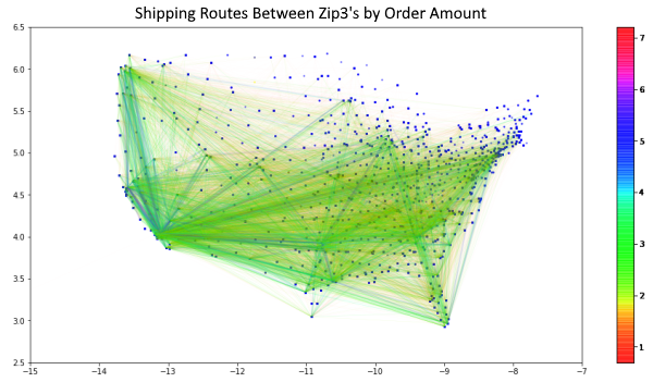
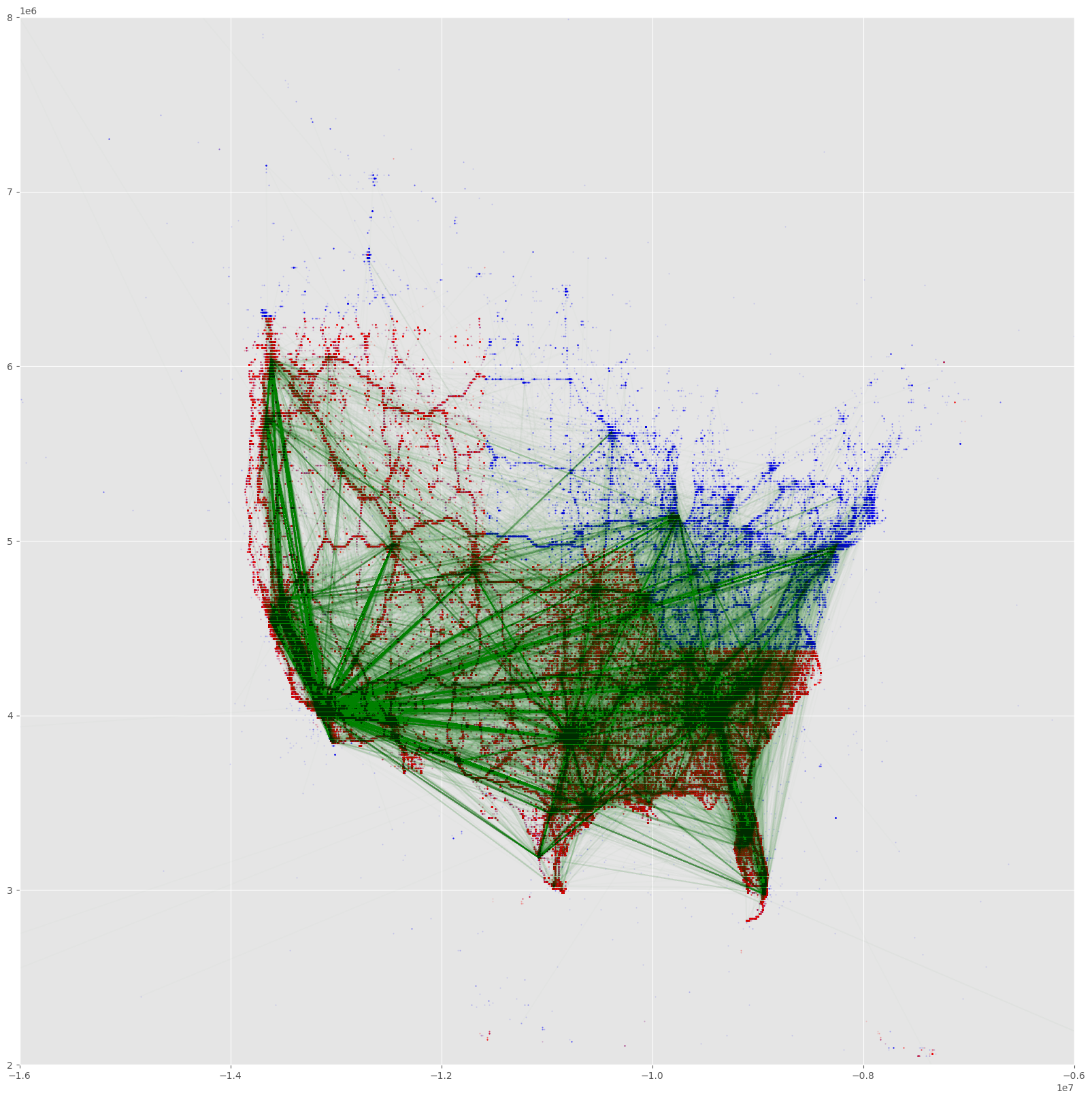
- This delivery route network map between the zipcode nodes gives the traffic or “amount of orders observed” along the delivery route.
- Southern California, Bay Area, New York, Seattle, Chicago, Florida, Atlanta, Dallas, seem to be very prominent centers.
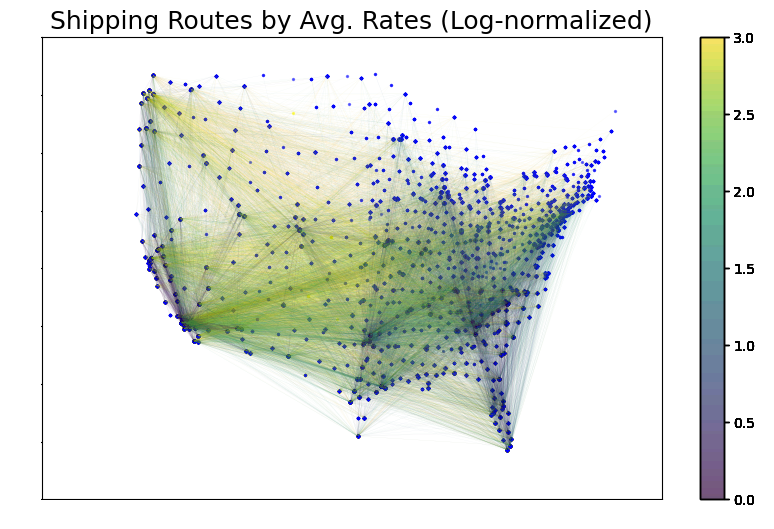
- This delivery route network map between the zipcode nodes give the average offer rates of orders that occured along the delivery route.
- It seems that the cheapest average offers rate tending to be along the west-coast states or from in/out of Florida.
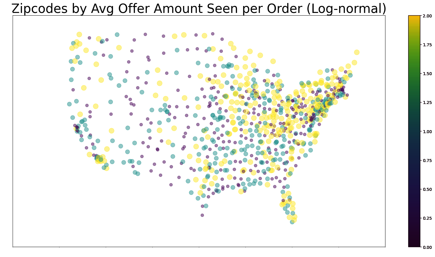
- This zipcode scatterplot gives the average offer amount per orders of given zipcode nodes (whether they were the origin or destination zipcode).
- It seems that the Great-Lakes Area and the Northeast seems to be a region that shows up a lot as the destination or origin zipcodes in orders with a high number of offers.
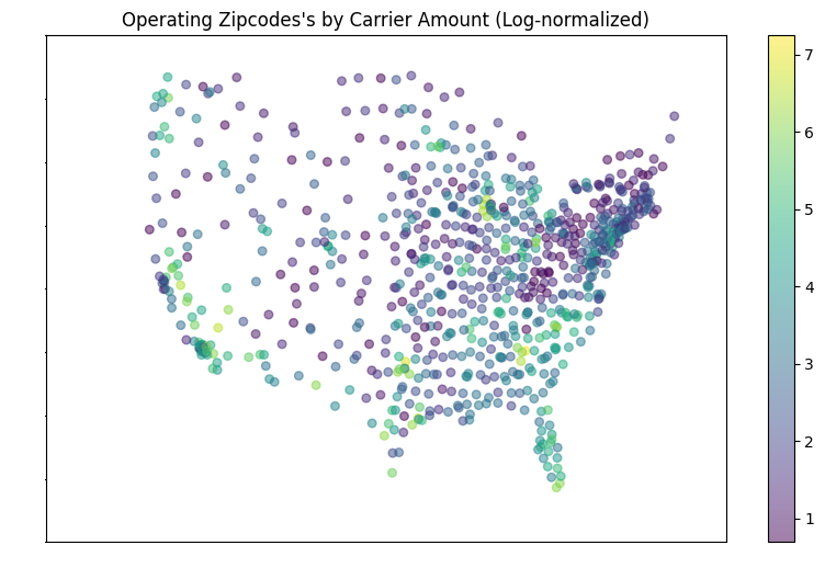
- This zipcode scatterplot counts how many carriers are based in different zipcode nodes
- While maps like these tend to show obvious population centers, that might not be fully the case here; for example, regions that should typically be very populated seem to have few or even 0 hubs: The Great Lakes area only has Chicago; meanwhile, NYC + the “BosWash” area (https://en.wikipedia.org/wiki/Northeast_megalopolis) seem to be almost nonexistent in this map!
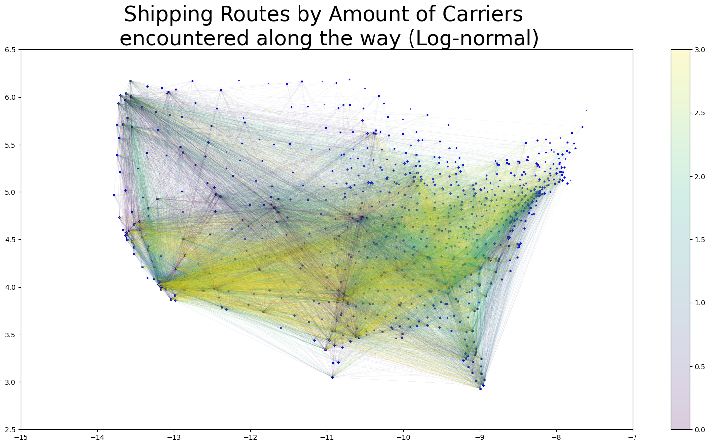
- This delivery route network map between the zipcode nodes gives the amount of “operating zipcodes” (a.k.a. a carrier’s home zipcode) orders that occured along the delivery route.
- The purpose of such a map is to see if it can symbolize “competitive” a delivery route tends to be; we expected that for delivery routes that go through the “jurisdictions” of many carriers will have a lot of competition for a given order, potentially driving down the offer rates.
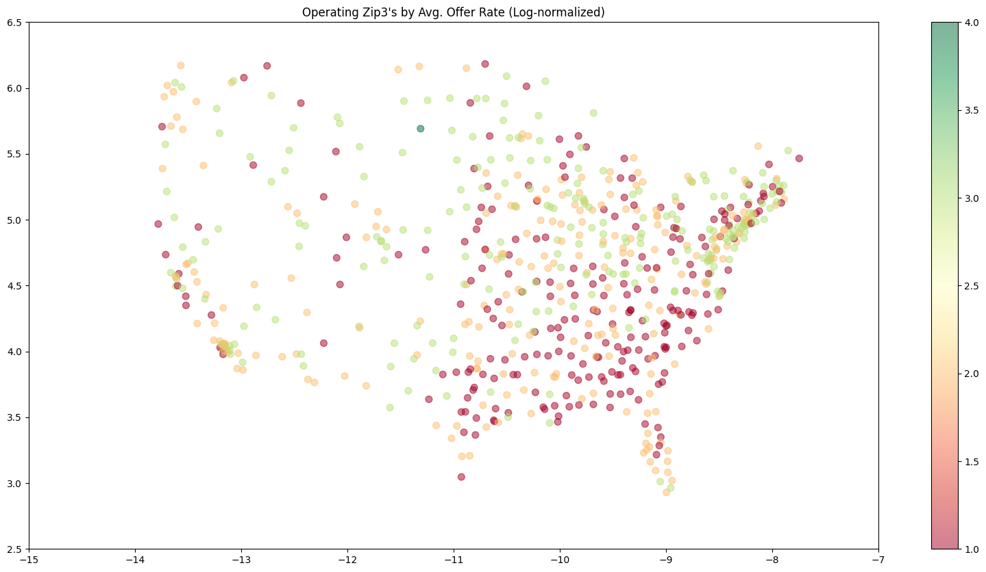
- This zipcode scatterplot weighs each “operating zipcode” (a.k.a. a carrier’s home zipcode) by their average offer rates
- It seems like for a given offer, if the carrier proposing it is in the South, their offer rate might be very cheap.
Prediction Model Visuals
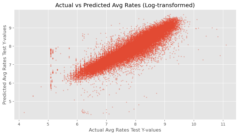
- This scatterplot gauges the accuracy of the first prediction sub-model that I worked on, which estimates the typical offer rate for a given order.
- Even with just a Linear Regression (Scikit-learn), I was able to achive 87% test accuracy; In this scatterplot,the true test-set y-values are compared against the predictions made by the linear regression, showing high accuracy because the cloud of dots are almost very straight and linear.
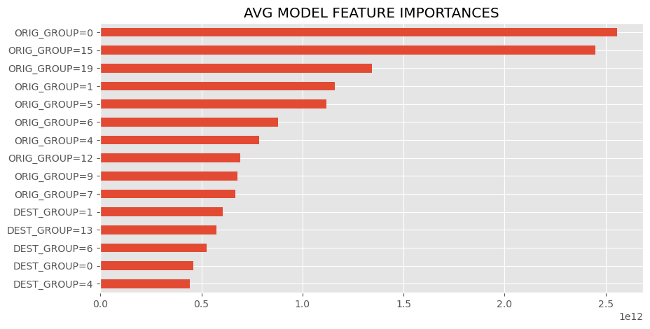
- This barchart ranks the most influential features in the first prediction sub-model, which I got by getting the absolute values of the linear regression coefficients. In this case, the column name format “ORIG_GROUP=X” means if the order’s origin zipcode node is in group “X” (see the metropolitan regions visualization). Likewise, “DEST_GROUP=X” means if the order’s destination zipcode node is in group “X”.
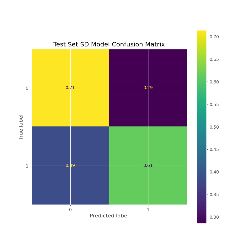
- This confusion matrix is for the second prediction sub-model that predicts the standard deviation of the offer rates for a given order (or more specifically, whether it’s “high” or “low”).
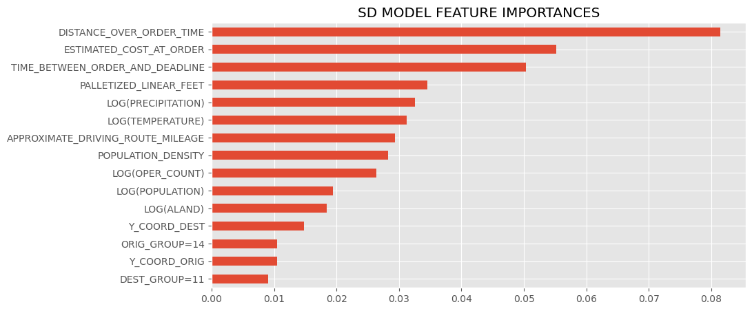
- This barchart ranks the most influential features in the second prediction sub-model, which uses the “.feature_importances” attribute of the sklearn model.
- It seems having geographic features is very important to the model’s accuracy, as many of these features pertain to information about the order’s delivery route.
- Several pertain to the delivery route’s road or weather conditions:
- LOG(POPULATION): the average population of all the counties that the order’s delivery route crosses through
- LOG(ALAND): the average land-area of all the counties that the order’s delivery route crosses through
- LOG(PRECIPATION): the average precipitation (rainfall or snowfall) of all the counties that the order’s delivery route crosses through
- LOG(TEMPERATURE): the average temperature of all the counties that the order’s delivery route crosses through
- POPULATION_DENSITY: the average population density (or urban-ness) of all the counties that the order’s delivery route crosses through
- APPROXIMATE_DRIVING_ROUTE_MILEAGE: the length of the order’s delivery route (the euclidean distance between the origin and destination zipcode node)
- Several pertain to the delivery route’s road or weather conditions:
PowerBI Visuals
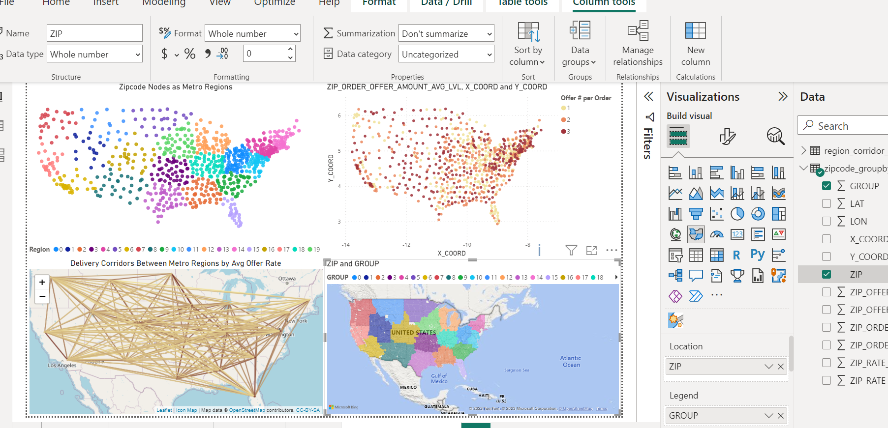
- PowerBI dashboard hooked to DuckDB